2.3 - Option Lists
Option lists
Option lists are an important part of Innobrix Studio. An option list lets you link options to a model. A model can be linked to one option list at most, but an option list can be linked to multiple models. Option lists can include a wide range of options, but in Innobrix we essentially distinguish two kinds of options:
-
Sales options
-
Functional options
Each kind of option has its own role. Functional options are almost always invisible to an end user, while sales options are intended to be offered to the end user (as the name suggests). A functional option could be something like "End facade right" to turn on the end facade on the right side of a home. That way you avoid needing an extra home type through Model Groups.
Creating an option list
When a model is imported for the first time an option list is created automatically, and it is empty. You can also use a CSV file to create a new option list, but in this tutorial we take the manual route.
-
Create a new
Categoryby RMB (right-clicking) on "Option list" in the top right. Name it "Uitbreiding". -
Create a new
Headerby RMB on "Uitbreiding" and choosing "New header". Name it "Achtergevel". -
Create a new
Optionby RMB on "Achtergevel" and choose "New option". Name the option "Uitbreiden achtergevel 2400mm".
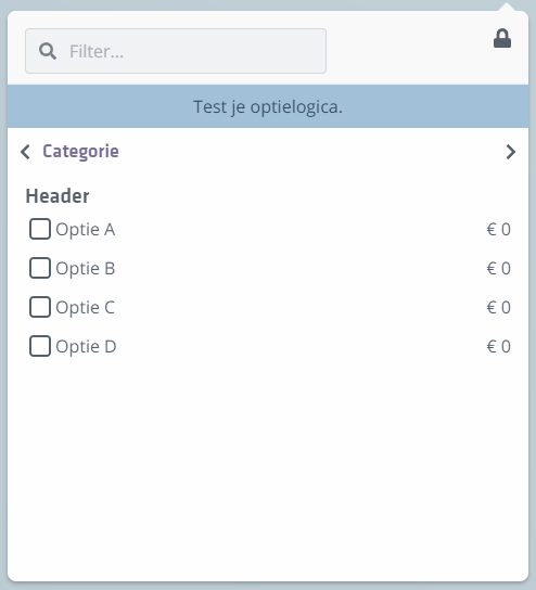
The option list consists of one or more categories, each with one or more headers, each with one or more options. If you followed the steps correctly you should see something like this in your option list:

A new option defaults to option type "Checkbox". Three other option types exist: Radio, Thumbnail, and Color. In this tutorial we cover Checkbox buttons and Radio groups and explain the visual and functional differences.
Option types: Checkbox & Radio
Every option has the property type, which can affect the inherent behavior of an option.
There are formally four different option types, though functionally there are really two. The Thumbnail and Color option types behave like Radio.
A Checkbox can be turned on and off. A Radio button can never be turned off-only swapped for another Radio button under the same Header.
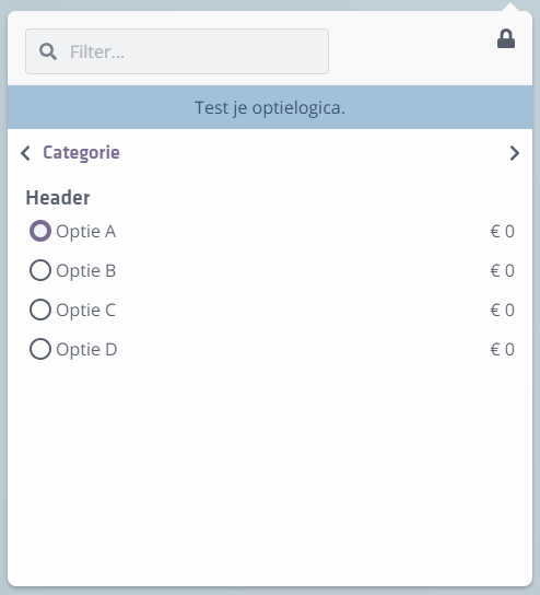
We just created the option "Uitbreiden achtergevel 1200mm". By default it is set to Checkbox, but try changing the option type to Radio. Then use the option menu on the left side of the screen to test it.
While clicking you will see this option can no longer be turned off. In that case you need an "extra" option such as "No extension" or "Base rear facade" so the buyer can turn the extension back off-something you do not need with a checkbox.
(For the next steps you can change the option back to type Checkbox.)